Archive for January 2014

Lighting Shutter Text Effect Tutoria


icanbeCreative teaches you how to create this beautiful slow shutter text effect.
Ok, firstly you need to create a new document at whatever size you wish to work at. I have used 1920 x 1200 because thats the size of my screen. You do this by pressing Cmd + N, unless your going to print the final piece then use RGB as it gives you a broader range of colours to work with. If your printing, then use CMYK. I also like to work using 16bit colour or above, it makes your gradients look much smoother.
Once your workspace is setup you will need to apply a base gradient (1. + 2.) Select the gradient tool by holding the mouse button down on the fill tool, then double click the gradient just below the menu bar. You now have the opportunity to create a custom gradient. Experiment by adding in different colours (click just below gradient bar & click color to change it) and moving them around (drag colour pointer left and right)
Once your happy click OK. Drag your gradient line whilst holding Shift to make sure you get an even gradient. If your not happy then try again, just hit Cmd + Shift + Z.
Now you have a good base it’s time to create the path. This will eventually be the text itself so you need to try and be as artistic as possible. Having some knowledge of paths will help quite a lot so to complement this tutorial nicely we have created a really easy to follow Paths tutorial, click here to read it now.
Create your new layer and select the Pen Tool (1.) and select the options below the menu bar as shown in the diagram. Now all you have to do is draw and drag (2.) your points until you have a flowing piece of text or some other dynamic shape, a smooth curvy line works best.
Now you need to stroke your line with a fine white brush. Select the brush tool and set the size to 2px (1.) Now click the paths tab in the layers menu and then click the Brush button (2.) This will stroke your line with white which represents the lights source and it’s brightest part.
To create a realistic outer glow don’t use the default settings! Right click on your new layer and select blending options, then select the outer glow option which will give you the menu shown in the diagram (1.) Now adjust the settings so they match the ones in the diagram. If your using a different overall colour then select once close to it, I have used a slightly lighter green than the background.
You now have a decent glowing path. The next part of the tutorial explains how to customize the whole image and make it unique so don’t feel limited by what you do next, it’s all about experimenting! There are lots of uses for this effect such as simulating moving lights in photo’s, creating cool masked animated light in flash, or just creating illustrations. We are creating a static wallpaper so if your ready, lets continue…
Firstly, we are going to enhance the background layer with some more simulated light. Do this by selecting a nice complementary colour in it’s brightest shade (1.) and a big 300px brush. The rest is up to you, but I recommend working on a fresh layer as this gives you the flexibility to build up a few colours. It also helps if you don’t like how its going, a bigger brush sometimes helps.
Once your happy with the background you will probably want to add some depth by copying your original linework. Do this by dragging the glowing line layer onto the new layer button in the layers menu twice (1.) This will look like to much at first but the next stage will really improve the image.
Go to the menu and click Filter > Blur > Guassian Blur and apply about a strength 5 blur. With this layer selected slightly rotate it using Cmd + T and you may want to distort it by holding Cmd and dragging a corner when the transform handles appear.
To add a really dynamic moving effect get your second duplicated layer and apply a radial blur to it. Do this by going to the menu and clicking Filter > Blur > Radial blur. Playing with different strengths will help you get the look thats right for your image. Its fairly strong on my piece hence the very opaque look. Less strength will create a more ‘ vibrational ‘ effect.
Finally I have added a few ways of making your artwork even more distinctive. The possibilities are endless but here’s what I’ve done.
Friday 24 January 2014

Hell of Tutorial in Photoshop

Hell of Tutorial in Photoshop

Step 1

The first thing you will have to do is create the 3D text. To do that you can use Illustrator. It has a very nice 3D filter and it will work just fine.
Type the text you want and go to Effect>3D>Extrude & Bevel. Change the Position to Off-Axix Bottom. Then you just rotate the X,Y, and X Axis until you get the result you want. Follow the image below for reference. Tip: It's very important that you select Draw Hidden Faces. Otherwise Illustrator will not create some faces that will be very important for the end result.
Hell of Tutorial in Photoshop

Step 2

Now you will have to expand the 3D effect in order to select and change the color of the faces you want. Go to Obejct>Expand Appearance. First select the top faces, and move them away. Then select just the outer faces and fill them with black.
Hell of Tutorial in Photoshop

Step 3 - Photoshop

Create a new document in Photoshop and fill the background with Black. Copy the 3D text without the top faces and paste it in Phothoshop. Position it in the middle of the document and reduce its size.
Hell of Tutorial in Photoshop

Step 4

With the Magic Wand Tool (W) select the black faces and delete them.
Hell of Tutorial in Photoshop

Step 5

Go to Images>Adjustments>Hue/Saturation, change the color of the text to Orange.
Hell of Tutorial in Photoshop

Step 6

Make sure you have black and white for the background and foreground colors. Then go to Filter>Render>Clouds... After that, resize the layer. Make it smaller just to cover the word. Then just change the Blend Mode to Color Dodge
Hell of Tutorial in Photoshop

Step 7

Now create a new layer on top of the others and fill it with black, then with the Brush Tool (B) select a regular brush, very soft, like 0% hardness, and white for the color. Then just paint over some ares to make them brighter. (1-4)
Hell of Tutorial in Photoshop

Step 8

Apply a Layer Style to the 3D word, use Stroke with 1px Size, 40% Opacity and Black for the color.
Hell of Tutorial in Photoshop

Step 9

Let's add a Gradient Overlay to the background. It will be necessary in order to make some of the light effects work. Use Radial for the Style and use Black and #412e1d(brown) for the colors.
Hell of Tutorial in Photoshop

Step 10

Now duplicate the 3D layer and go to Filter>Blur>Gaussian Blur use 30px for the Radius. Position this layer beneath the Hell layer.
Hell of Tutorial in Photoshop

Step 11

With the Ellipse Tool(U) create an ellipse like the image below, then go to Filter>Blur>Gaussian Blur. Use 70px for the Radius. After that, just change the Blend Mode to Overlay.
Hell of Tutorial in Photoshop

Step 12

Create a new layer on top of the Backgroud layer. Fill it with white and go to Filter>Texture>Texturizer. Use 60% for Scaling, 15 for the Relief and Top for the Light. Change the Blend Mode to Multiply.
Hell of Tutorial in Photoshop

Step 13

Here I wanted to add a nice texture to the floor, so I used a wooden texture. You can find the one I used at http://www.sxc.hu/photo/947335. Or you can check the Great Wood Textures at http://abduzeedo.com/great-wood-textures.
Paste the image in the document and resize it to make it cover the gradient area. Then go to Edit>Transform>Distort. Move the vertices to apply a nice perspective to the wood. After that just change the Blend Mode to Multiply.
Hell of Tutorial in Photoshop

Step 14 - Fire

Now let's create the fire. To do that I will use what I learnt from the awesome Dramatic Text on Fire Effect in Photoshop by Collis from PSDTUTS.com. Basically we will get a photo of fire with flames and use the Warp tool to create different variations of the flame.
Download the image at http://www.sxc.hu/photo/985088 and paste it in the document. Make sure that it's in front of the other layes. Then with the Eraser Tool (E) delete some areas. Also go to Edit>Transform>Warp and distort the flame to get a nice effect. Then just change the Blend Mode to Screen.
Hell of Tutorial in Photoshop

Step 15

Create more flames using the same technique, you can even use the Smudge Tool (R) to change the form of the flames.
Hell of Tutorial in Photoshop

Step 16

Create a new layer in front of the other layers and go to Filter>Render>Clouds. Make sure you have selected Black and White for the Background and Foreground colors. Then you can resize the layer a bit to make the smoke smaller. With the Eraser Tool (E) delete some areas and just leave smoke over the text. Then change the Blend Mode to Soft Light.
Hell of Tutorial in Photoshop

Step 17

Repeat the same thing as the previous step, this time however use Hard Light for the Blend Mode. This step will create a more volumetric smoke to the image.
Hell of Tutorial in Photoshop

Step 18

Let's create the cracks on the floor. To do that let's use another image from sxc.hu, you can download it at http://www.sxc.hu/photo/995884. Place the image on the document and resize it to cover the gradient area. Then like we did before with the wood texture, go to Edit>Transform>Distort. Distort the image until you get a nice perspective, then change the Blend Mode to Multiply.
Hell of Tutorial in Photoshop

Step 19

This step might look complicated but it's not. Actually it's quite simple. Duplicate the crack layer and change the blend mode to Normal again. Go to Image>Adjustments>Invert, then go to Image>Adjustments>Desaturate. This will invert the colors so what was once black will now become white and vice-versa. Now go to Image>Adjustments>Levels and use 40, 1.00, and 226.
Right after that select the Magic Wand Tool (W) and select the black part of the image. Then go to Select>Similar, Photoshop will select all the black from the layer. Then delete the blacks and you will have the cracks in white. Now just apply a Layer Style. Go to Layer>Layer Styles>Color Overlay. Use #ffba00 for the color.
Hell of Tutorial in Photoshop

Step 20

Select the Eraser Tool (E) with a big soft brush, use 0% hardness. Then start deleting the layer. Leave just a small area close to the word. After that go to Filter>Blur>Gaussian Blur. Use a small value 0.5%. Then the last thing here, move this layer 2 pixels left and bottom, so it will create a nice 3D effect.
Hell of Tutorial in Photoshop

Step 21

Here you can duplicate the yellow crack layer and apply a another gaussian blur, this time use a greater value and change the Blend Mode to Color Dodge. If you want you can duplicate it one or two more times to make the effect brighter.
Hell of Tutorial in Photoshop

Conclusion

You can add more cracks or change the flames, now it's up to you. The idea of this tutorial was to create an image using fire coming from hell, like a deeper place using 3D typography. It's basically a mix of tutorials and techniques. It's all about playing and looking on the web, there are really great tutorials out there.
Hell of Tutorial in Photoshop

Electifying Energy Beams Tutorial

Electifying Energy Beams Tutorial
Firstly, create a new layer, then grab your Pen Tool (P) and draw out a spiraling path, as if you have a snake wrapped around the arm.
Then select the Brush Tool (B) and set your diameter to 7px, with the Opacity and Flow at 100%, and your foreground color set to white. With your path still on the artwork, go back to the Pen Tool, right click on the canvas, and choose "Stroke Path." A menu will appear with the Brush set as the Tool. Check "Simulate Pressure" and press OK. This will make the beginning and end of your stroke thinner.
Now you need to delete the parts you want hidden behind the arm. With your stroke layer selected, choose "Add layer mask" at the bottom of the Layers Palette. Use the Polygonal Lasso Tool (L) to select areas of the arm you want in front of the stroke -- use your eye and imagine how this path will wrap around the arm. Make sure your mask is active by clicking on it, and fill these selected areas with black. They should now be cut out, appearing as if they're behind the arm.
Right click on your stroke layer and choose Blending Options. A Layer Style menu will appear, where you'll be adding an Inner and Outer Glow to the stroke, making the edges of it glow with a blue hue. Use the settings below:
Make a copy of your stroke layer and right click on the Layer Effects icon. Choose "Clear Layer Style" -- we simply want to blur this layer (about 6 pixels) to add another layer of glow. Everything's looking nice and illuminated here, so let�s add some sparkles. With your Brush Tool, add some quick spots around your glowing path with varying small brush sizes (3 - 5px). Make as many as you want here, as you're always free Erase undesired sparkles.
We're now going to make a secondary stroke to create another level of motion. Use the Pen Tool to go over your original path, but make it a bit different and overlap parts. Select a smaller diameter brush this time with a 50% opacity, and stroke the path as before.
Our energy beam is nearly there. To make the effect more dramatic, you can adjust the overall hue of your photo. Create a new Curves adjustment layer, and tweak the colors to get a vibrant blue atmosphere. Download the Curves preset below to load it in your document. After your colors are locked in, use the Dodge Tool (O) (with a diameter of 35 pixels and the exposure set to 25%) to brush in some highlights underneath your beam, directly on the background photo. This makes it appear as if your beam is casting light on to the arm.
Download blue.acv
For the last part of this effect, we'll add one more layer of shimmer. Hold down Ctrl and click on your main stroked path in the layers palette -- your path should now be selected. Go to Select › Modify › and Expand the selection by 7px, then feather it by 10px.
Now select your background photo layer and apply a Plastic Wrap filter, found in your Artistic filters. This will add some wispy lines around your path. Set the Highlight Strength to 20, the Detail to 6, and the Smoothness to 8. Finally, lightly Gaussian Blur your background layer with the feathered selection still active.

Creating Energy Spheres in Photoshop

Creating Energy Spheres in Photoshop

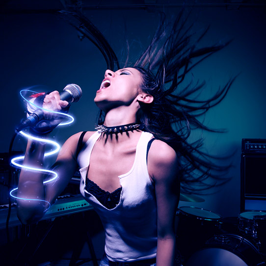
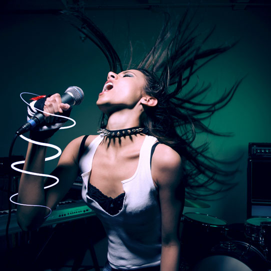
This will be the final result.
  1. Download the brush set and install it.
  2. Now I’ll show how to take a child with a big imagination and turn him into the powerful being he imagine himself to be.
  3. We’ll start by creating a new layer on top of our original and filling it with black. Next we want to selectFilter >> Render >> Lighting Effects >> Lens Flare
  4. Use the 105mm Prime with the Brightness setting of your choice.
    Lens Flare
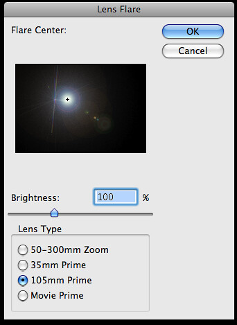
  5. This will create a bright flash. Move it to the point where you want the ‘energy ball’ to appear.
  6. You may notice that when you move it, you can see the edges of the layer. To rectify this, select the layer and add a ‘Layer Mask’.
  7. Select default colors (white and black). With the layer mask selected, use the Gradient Tool >> Radial Gradient >> Reverse and drag from the center outwards. This will mask everything in a sphere around the center.
  8. Set both of these layers to the ‘Hard Light’ setting.
  9. I like to use the Image >> Adjustments >> Photo Filter to make the colors “pop”. I also used this setting to make the lens flare a bluish color. There are other ways to do this so experiment with your options.
  10. Using the Brush set we installed earlier we want to apply them to the energy balls. I used the color black, with the layer’s Blend Options set to ‘Overlay’.
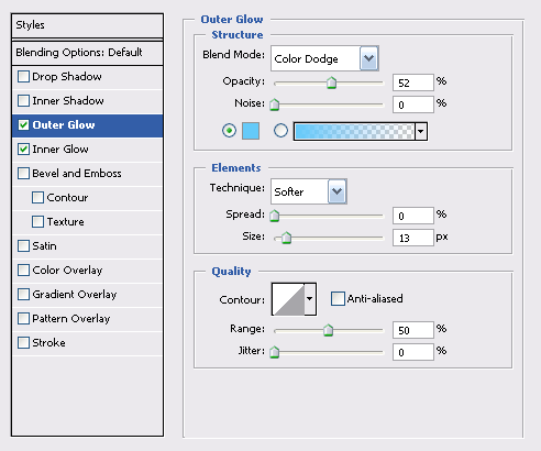
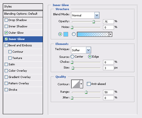
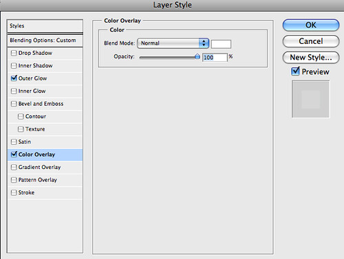
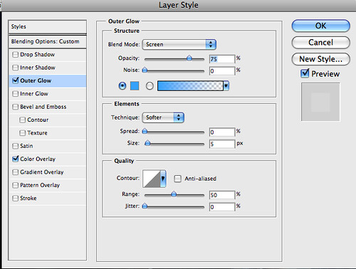
  11. With this layer selected, set the Layer Style settings like so:
  12. Using the same technique that we used in Step 7, we want to mask the edges of our brush layers.
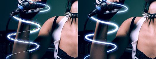
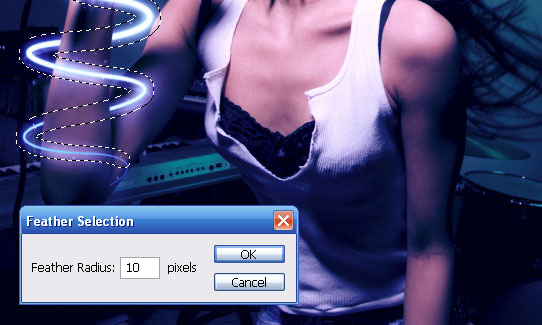
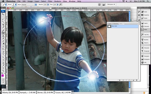
  13. To create the ‘arc of light’ we’ll use paths. Select the ‘Ellipse Tool’ and change it from ‘Shape layers’ to ‘Paths’. Now, draw a large circle or ellipse that includes both energy flares.
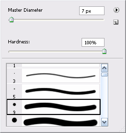
  14. Once the arc is drawn we want to stroke it (no jokes please). Select a brush that’s very small, maybe about a brush with a 5px diameter and use the color white. Go to ‘Paths’ right click on the selected path, and select ‘Stroke Path’. Check the ‘simulate pressure’ option, this will give the ring a bit of perspective with a heavier stroke on one side and a lighter stroke on the opposite side.
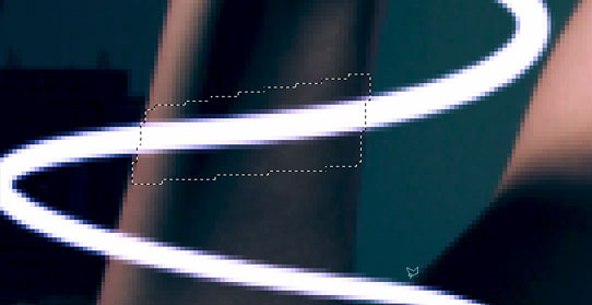
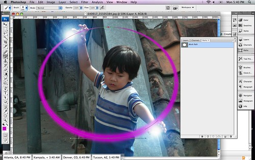
  15. Repeat this step twice. Each time use a different brush setting that is bigger than the one before it. I started with the 5px brush, then I used a 45px brush followed by a 100px brush. Each time use a different color. The topmost (bigger) arc should be set to ‘Linear Dodge (Add)’ with an opacity of 35%. The middle layer should be set to ‘Overlay’ and the original (the white one) should be set to ‘Linear Dodge (Add)’.
  16. I grouped these together then, using the technique from Step 7 again, I use layer masking to block one half of the sphere I created.
  17. To create the energy ‘tendrils’ that are leaping from the arc. Duplicate the grouped folder from Step 16. Then merge the group or folder into one layer. Select Filter >> Liquify and distort the arc to look like it should for your image. Secondly, we’ll select Filter >> Distort >> Ripple and tweak it to look a bit more like electricity.
  18. Now we’re done. Outside of some techniques that I used to make the image more polished, this completes the tutorial.

Popular Post

Blogger templates

Powered by Blogger.

Search This Blog

- Copyright © OZAM EDITING STUDIO -Metrominimalist- Powered by Blogger - Designed by Johanes Djogan -